Supermarkets are on a mission to overhaul negativity around frozen being poor quality. In 2017, Iceland stated that they were, “looking to lead a revolution in how we talk about frozen food”, and with this we’ve seen a flurry of NPD within the sector, giving it an exciting new look far from the frozen roast dinners of times gone by. The category now holds a complex image that embodies a multiplicity of packaging codes. In this article, we apply a semiotic lens to the category to explore the new face of frozen.
Frozen reborn
When it comes to grocery shopping in the UK fresh used to prevail, as it was seen as the best choice for nutrition and health. Frozen on the other hand, has traditionally held a negative stigma, being seen as cheap, low quality and synonymous with discount stores such as Farmfoods, conjuring up an image of defrosted prawn cocktails from 70s dinner parties. However, this reputation is changing and frozen food has recently had something of a revival in the UK. After three years of stagnation and decline, the frozen food category has risen from the FMCG ashes to become this year’s best performing category within food and drink*. And with its sparkling performance, the products within the segment are changing how they communicate on shelf, bringing excitement, more confidence, emotion and practicality into the design of its packaging.
The frozen food of today is very much catering to three of the biggest consumer trends in food: convenience, health, and sustainability. Today people have more flexible ways of working, which means traditional meal times are changing. This has opened up an opportunity for retailers and brands to provide a no-hassle reliable meal. According to the Grocer, “average cooking times have come down in 19 of the past 20 years”. Step in frozen food. Frozen is delivering to the needs of many who are looking to create a quick meal that will sustain, delight the palate and be healthy too. Frozen also comes hand-in-hand with minimising food waste and saving your pennies. Factors, which resonate considerably with many people who are tightening their purse strings in the wake of Brexit and those who are conscious about cutting down their food waste.
Functional to emotional
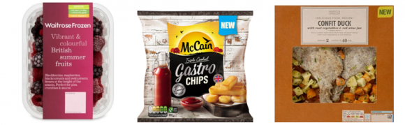
The design language has changed to appeal more to our culinary desires – rather than cueing a functional simple substance, frozen has morphed into serious culinary choice. It now feels more premium, more authentic and more honest than ever before. This is largely down to an overhaul of its packaging design, which is changing the communication of frozen by adopting many cues from the fresh food aisles. Examples include: the use of transparency, higher quality packaging materials and use of romanticised language, illustrated by Waitrose Frozen British summer fruits, McCain Gastro Chips & M&S Confit Duck below.
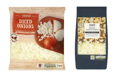
In recent months, Tesco has capitalised on this re-invigoration by introducing new packaging design for its frozen vegetables. Moving from its old authentic / rustic image, which suggested hand diced ingredients, to packaging that feels more premium and sophisticated, created by its black profile and slimmer proportions, which make it feel more select and less commoditized.
Greater product confidence
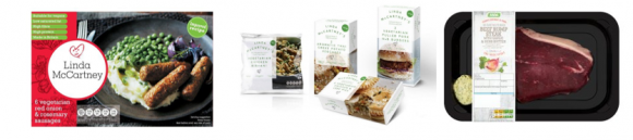
Before its redesign, Linda McCartney focused on the end meal, in a very traditional British way (meat and two veg!). Today the new pack shifts its focus to the deliciousness of the food inside – with the tag line ‘deliciously succulent’. The stripped back simplicity of its pack heroes the product and gives consumers license to envisage their meal creation. Asda’s prepared frozen meat range is packaged in a way that gives a prospective buyer full view of quality cut and sauce, showing overt confidence in its produce.
 Exciting and practical
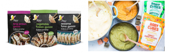
Manufacturers have capitalised on this newfound popularity, and as a result shelves hold an array of quick easy meal solutions and cooking ingredients. What is notable about these new products is they are not only high quality but, attention grabbing and offer practicality that a tired worker returning home or a busy mum can rejoice over. Take itsu’s new range of gyozas, which conjures up an image of gourmet Japanese cuisine, with its use of curated photography on a black backdrop, striking colours signalling its variants and comes complete with a re-sealable pouch. Baby Cubes made by two parents, who wanted to spend less time in the kitchen and more time living, created a worry free naturally healthy product for kids. Its packaging captures that innate sense of fun and cute simplicity.
Meat free identity
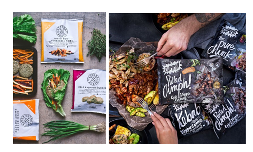
Many brands have seen innovation opportunities to tap into the rise of veganism / vegetarianism, with supermarkets now stocking more frozen veg / vegan meals than ever before. Brands such as Strong Roots, have launched a range of vegan products, in the aim of revolutionising the frozen market. The packaging is simply constructed, celebrating the meat free products inside, with a clean identity that jumps out from rows of shiny flexibles. Oumph has also followed suit, launching in packaging that cues indulgence reminiscent of rustic American smokehouses. This particular example is an illustration of a much bigger set of signifiers across vegetarian products that embody cues derivative from the meat category. Unlike Strong Roots, Oumph is still holding on to cultural associations of meat alternatives, in which it makes acknowledgment that a meal cannot be a meal without meat, so dress it up as if it was the meat component.
Frozen lifestyle
It’s no doubt retailers have been disrupted the popularity of meal kits DTC, one of the fastest growing food sectors, worth between $3 billion and $5 billion, and led by the likes of HelloFresh and Gousto. Expectedly start-ups have jumped on the DTC bandwagon. Take ‘Gourmade’, a brand that delivers frozen ready meals straight to your door, taking out the preparation all together! This is no longer a frozen meal for when we don’t have the energy or motivation to cook, but a lifestyle choice. This focus on, ‘precious time’ and our continued unwillingness to compromise on food quality or experience, is very much present right now in British culture and is heavily reflected in Gourmade’s design. The brand name itself is of course highly suggestive of its quality and the personal touch behind it, with its hand script typeface solidifying this idea. The box has also been crafted to deliver an exciting experience, from first sight of the bold colours through to experiencing the product story on opening. Gormade have deliberately constructed its products to coax consumers into believing their meals are just as good as fresh / homemade meals. A subtle undertone suggesting that the frozen hang-ups from the past are still lingering below the surface.

The future of frozen
Looking forward, this sector is set to continue thriving, as more and more time poor and savvy consumers discover the wonders frozen food can bring. Brands and own label owners have changed the way they visually communicate and by doing so have new clusters of meaning across the segment. Frozen has stepped away from a very functional past into a much more vibrant emotive space, now imparting more visual language around quality, experience and culinary delights in stores and online.
However, frozen hasn’t gone without its share of bad press, with the recent listeria outbreaks. Will this challenge its newfound credentials? Given the rise in food prices and recent food shortages, which could heighten when the UK leaves the EU and the continued threat global climate change could increase strain on our food supplies. I can only be left to think that consumers will continue to embrace frozen food. Brand owners will look to use visual and sensory cues to strengthen frozen food credentials in order to remain culturally relevant. For older players in this space, this could be a challenging time, as the old ways of communicating frozen are being redefined by new players.
Remaining relevant in frozen food is an example of a challenge where we’d use semiotics to deeply interrogate cultural movements and identify new ways in which brands are striving to appeal to consumers, in order to advise our clients on how to remain competitive in the face of change.
The Culture & Trends team at Join the Dots use commercial semiotics to help our clients ensure they stay culturally relevant. You can find out more about our work here and get in touch to talk about our commercial semiotics offer.
* Frozen food category report 2018, Grocer